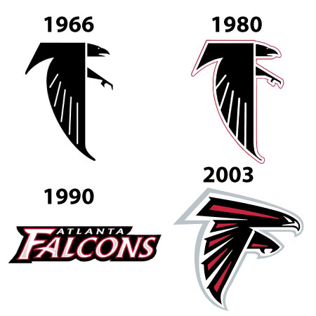
The Atlanta Falcons’ logo has undergone several changes and iterations since the team’s inception in 1966. Here’s a brief overview of the evolution of the Atlanta Falcons’ logo:
- 1966 – 1979: The original Falcons logo featured a simple yet bold design, depicting a black and white falcon in flight, with its wings spread widely. The bird was shown in profile with its distinctive pointed beak.

- 1980 – 1989: The team introduced a more stylized and aggressive-looking falcon logo during this period. The falcon’s design was sleeker and more angular, featuring red and black colors to represent the team’s identity.

- 1990 – 2002: Atlanta Falcons word mark font changes.

1990-1997 
1998-2002 - 2003 – Present: In 2003, the Falcons introduced a significant logo and uniform redesign. The new logo featured a more modern and stylized falcon, showcasing a forward-facing bird in flight with a sleeker appearance. The colors remained red and black, but the design became more streamlined and contemporary.

Redesign of the Atlanta Falcons Logo in 2003
The Atlanta Falcons logo redesign in 2003 brought a significant update to the team’s visual identity, emphasizing a more modern and aggressive look that better reflected the competitive spirit of the team.
Before 2003, the Falcons logo consisted of a stylized eagle with softer lines and a flatter appearance. The new version introduced changes in both colors and outlines, giving the logo a more dynamic and three-dimensional look.
The falcon’s silhouette, now with a sharper, more angular posture, symbolized speed and determination. Additionally, the shape of the falcon was adjusted so that the wing and tail formed an “F” for “Falcons,” which became a unique and distinctive design element.

Another significant change was in the color palette. The redesign brought red more prominently into the logo, along with black and white, creating a bolder and more visually striking contrast. This combination of strong colors aimed to represent the intensity and passion associated with football.
The 2003 redesign was widely appreciated and continues to be used today, standing out among NFL logos for its sharp aesthetic and for reflecting the style and energy the team wants to convey to its fans.
Redesign of the Atlanta Falcons Helmet with the New Logo
The redesign of the Atlanta Falcons helmet in 2003, featuring the new logo, was an essential extension of the visual updates that brought a modern and aggressive vibe to the team’s identity. The helmet was updated to reflect the strength of the new logo, incorporating it in a more stylized and commanding way.
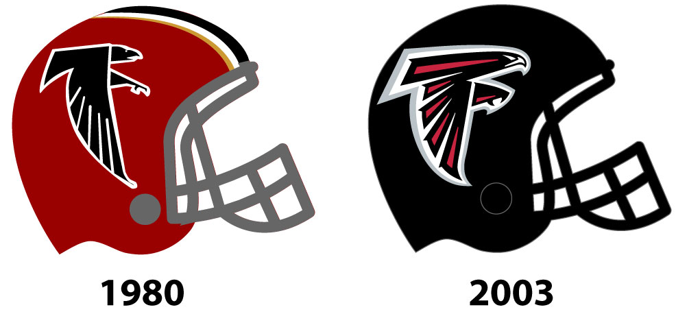
The helmet color remained predominantly black, a choice that reinforced the team’s intensity and aggression. However, with the new logo in red, black, and white, the contrast became even more striking and powerful, making the falcon emblem stand out boldly.
The logo’s positioning on the sides of the helmet was adjusted to a larger size, better utilizing the space to ensure the falcon symbol was prominent even from a distance. This adjustment allowed the dynamic elements of the logo, such as the sharp lines and curves forming the “F,” to be easily recognizable during games.
The combination of the new logo’s sharp lines with the black helmet color made this design one of the most distinctive in the NFL, creating a powerful and intimidating visual image that resonated with fans and the team’s culture. This helmet redesign not only refreshed the Falcons’ look but also reinforced an image of a fast and determined team, aligning with the competitive philosophy on and off the field.
The Essence of The Falcan
Throughout these changes, the team maintained the essence of the falcon as a symbol of strength, agility, and speed, but the designs evolved to reflect contemporary aesthetics and design trends. The current logo introduced in 2003 remains the primary emblem used by the Atlanta Falcons in the NFL.

