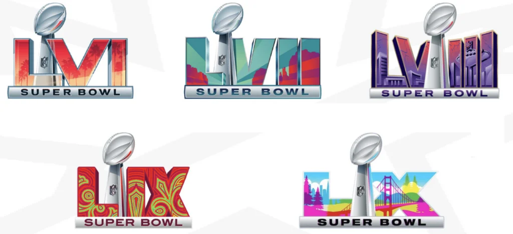
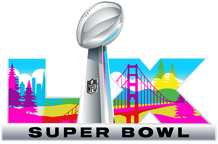
The official logo of Super Bowl LX has been unveiled, and it’s already sparking conversations among NFL fans and design enthusiasts alike. Set to take place on February 8, 2026, at Levi’s Stadium in Santa Clara, California, this year’s mark blends the grandeur of the NFL’s biggest stage with the vibrant personality of the Bay Area.
Design Notes – Super Bowl LX Official Logo
Primary Visual Elements
- Roman Numerals (LX): Central to the composition, with custom beveled edges to create depth and a metallic sheen effect.
- Iconography:
- Golden Gate Bridge silhouette integrated into the “L.”
- San Francisco skyline and rolling hills embedded within the “X.”
- Redwood trees subtly framing the upper edge.
Color Palette (Approx. Pantone Matches)
- Vivid Pink: Pantone 1915 C – represents Bay Area sunsets and injects a fresh, vibrant energy.
- Sky Blue: Pantone 299 C – symbolizes the Pacific horizon.
- Golden Yellow: Pantone 123 C – nod to California sunshine.
- Emerald Green: Pantone 347 C – reflects the redwood forest and natural landscapes.
- Neutral Gray/Metallic: Approx. Pantone Cool Gray 7 C – structural contrast and logo framework.
Typography
- Custom sans-serif block lettering for “SUPER BOWL” — geometric and wide-set for legibility across broadcast, digital, and merchandise applications.
- Bold, condensed letterforms ensure the mark remains readable even at reduced sizes.
Composition & Layout
- Symmetry: Numerals are centered with balanced negative space around the main graphic elements.
- Depth Effects: Layered gradients give the illusion of dimension without compromising flat reproduction needs for print and embroidery.
- Adaptability: Designed to scale seamlessly for on-field graphics, apparel patches, and digital thumbnails.
Branding Strategy
- Keeps the Super Bowl logo system consistent for brand recognition while tailoring landmark and color cues to the host city.
- The CMYK-inspired palette strategically avoids heavy reliance on any single NFL team’s colors, eliminating “logo predicts the finalists” speculation.
Continuing the Super Bowl Logo Evolution
Since Super Bowl LVI, the NFL has moved toward a consistent design framework, integrating the Roman numerals with key visual references from the host city. For Super Bowl LX, that means the iconic Golden Gate Bridge, the San Francisco skyline, and towering redwood trees—instantly recognizable symbols of Northern California.
This iteration continues the trend of creating a localized brand identity without straying too far from the league’s unified Super Bowl logo system. The result is a design that works seamlessly across broadcast graphics, merchandise, and on-site branding while still feeling unique to its host location.

Why Pink Takes Center Stage
One of the most striking elements in the official logo of Super Bowl LX is the use of a vivid pink tone—something rarely dominant in NFL branding.
According to the league, the color palette draws from a CMYK-inspired spectrum, intentionally incorporating bright and unconventional hues to represent the Bay Area’s dynamic sunsets, cultural diversity, and creative spirit. The inclusion of pink also serves a strategic purpose: to move away from the “team color prediction” conspiracy theories that have floated around in previous years, where fans attempted to guess the Super Bowl contenders based on the logo’s color scheme.
A Stadium with History
Levi’s Stadium is no stranger to the spotlight. Hosting Super Bowl 50 in 2016, it offered a modern, high-tech fan experience that the NFL is looking to replicate and enhance for 2026. The location, climate, and proximity to San Francisco give this year’s event a distinctive West Coast vibe that’s reflected in the logo’s energetic aesthetic.
No Alternate Uniforms Expected
While some fans might hope for one-off Super Bowl uniforms, NFL policy requires teams to wear their standard home or away uniforms for the championship game. Even with the league’s growing use of alternate designs—like the “Rivalries” program launched with Nike—those remain exclusive to select regular season matchups, not the Super Bowl.
Final Thoughts
The official logo of Super Bowl LX strikes a careful balance between tradition and modern flair. It pays homage to the Bay Area’s landmarks and creative energy while staying true to the NFL’s brand consistency. For design enthusiasts, it’s another example of how the league is refining the Super Bowl’s visual identity into something that feels both collectible and adaptable year after year.
Whether you’re in it for the football, the halftime show, or the aesthetics, Super Bowl LX’s logo is one worth remembering.

