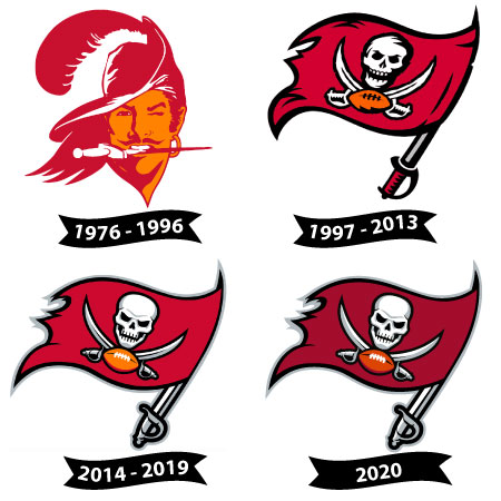
The Tampa Bay Buccaneers’ logo has undergone significant transformations since the team’s inception in 1976, reflecting changes in the franchise’s identity and aesthetic over the decades. Below is an in-depth look at the major milestones of its evolution.
Evolution of the Tampa Bay Buccaneers Primary Logo
The evolution of the Buccaneers logo is more than a series of aesthetic changes; it mirrors the team’s journey through highs and lows. The cheerful but ill-fated “Bucco Bruce” logo represented an era of struggle and growth, while the modern pirate flag embodies resilience, strength, and victory.
Today, the Buccaneers logo stands as an iconic representation of the NFL, merging tradition and innovation to captivate fans and inspire pride.
1976 – 1996: “Bucco Bruce” and the Original Era
The Buccaneers’ first logo, affectionately known as “Bucco Bruce,” was designed by cartoonist Lamar Sparkman. It depicted a flamboyant pirate with a wide-brimmed hat, a red feather, a hoop earring, and a dagger clenched between his teeth. Bruce’s winking eye added a cheeky and lighthearted touch to the design.
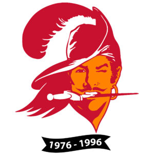
The logo’s primary colors, orange and red, nicknamed “creamsicle,” represented Florida’s citrus industry and its sunny warmth. However, over time, the logo became closely tied to the team’s struggles on the field. The Buccaneers endured numerous losing seasons in their early years, and “Bucco Bruce” became a symbol of that challenging period.
1997 – 2013: The Intimidating Pirate Flag
In 1997, the franchise made a bold move to rebrand itself, retiring “Bucco Bruce” and introducing a more intimidating logo. The new design featured a red waving pirate flag attached to a sword as its mast. The flag displayed a white skull with crossed swords and a football in the center, symbolizing danger, strength, and competitiveness.
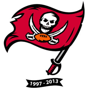
The color scheme shifted dramatically to deep red, black, and pewter (a metallic gray), abandoning the cheerful orange. This transformation coincided with a significant improvement in the team’s performance, culminating in a Super Bowl XXXVII victory in 2003, which solidified this logo as a mark of success.
2014 – 2019: Modernizing the Design
In 2014, the Buccaneers updated their logo again while retaining the pirate flag design introduced in 1997. The flag was given a brighter, more vibrant red color, and the skull and crossed swords were redesigned with sharper, more aggressive features. The football at the base was enhanced with additional detailing to give it a three-dimensional appearance.
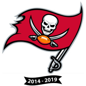
The logo’s size on the helmet was also increased, making it more prominent. Additionally, chrome facemasks were introduced on the team’s helmets, adding a modern and futuristic touch to the overall uniform.
2020 – Present: A Return to the Classics
In 2020, the Buccaneers embraced a modernized version of the 1997-2013 logo design. The flag retained its iconic dark red hue, and the skull, swords, and football were refined for a sleeker look. The updated logo reflects a balance between tradition and contemporary design, honoring the team’s legacy while keeping it relevant.
This return to the classic design coincided with a resurgence of success, as the team won Super Bowl LV in 2021, led by Tom Brady. The logo now serves as a symbol of both the team’s history and its promising future.
Why “Bucco Bruce” Was Retired
The original “Bucco Bruce” logo, used by the Tampa Bay Buccaneers from 1976 to 1996, was retired for symbolic, practical, and strategic reasons tied to the franchise’s identity and public perception. Below are the main factors that led to this decision:
Association with Poor Performance
During the years “Bucco Bruce” represented the Buccaneers, the team suffered from a predominantly poor track record. This included their inaugural 0-14 season in 1976. While the team had moments of success in the 1980s, such as playoff appearances, their overall performance fell far short of expectations.
As a result, the logo became synonymous with failure and underachievement, creating a negative association that weighed heavily on the team’s image, especially by the 1990s when the organization sought to rebrand itself.
Need for Modernization
By the 1990s, “Bucco Bruce” was considered outdated, with its cartoonish style and an expression that some saw as too lighthearted for a tough sport like football.
As the NFL grew in popularity and other teams updated their branding with more aggressive and modern designs, the Buccaneers needed to follow suit to remain competitive in their visual identity and attract a new generation of fans.
New Philosophy and Rebranding
Retiring “Bucco Bruce” was part of a larger effort to completely overhaul the team’s identity. In 1997, the Buccaneers introduced a new logo featuring a waving pirate flag with crossed swords and a skull, as well as a football at its base. This marked a departure from the past and signaled a fresh, more competitive era for the franchise.
This shift also brought a clear message: the Buccaneers were ready to leave their reputation as perennial underdogs behind and embrace a more formidable presence. This rebranding coincided with improvements on the field, such as the hiring of head coach Tony Dungy, who led the team to a winning trajectory.
Mixed Reception to “Bucco Bruce”
While some fans appreciated the unique and quirky charm of “Bucco Bruce,” others felt it was too flamboyant or “soft” for the rugged nature of football. This contributed to the desire for a more serious and intimidating logo that better aligned with the NFL’s competitive spirit.
Expanding the Fanbase and Marketing
The redesign also had commercial motivations. A new logo and updated colors created opportunities for fresh merchandise, such as jerseys, hats, and other gear, boosting the team’s marketability and revenue. Adopting a bolder, more aggressive image helped attract a broader and more diverse audience.
Legacy of “Bucco Bruce”
Though retired, “Bucco Bruce” remains a beloved nostalgic icon for many fans, symbolizing the team’s early history. It occasionally reappears for marketing initiatives or “Throwback” games, where the Buccaneers wear classic uniforms. While the redesign marked a crucial turning point for the franchise, “Bucco Bruce” endures as a reminder of a unique era in NFL history.
The Evolution of the Tampa Bay Buccaneers Wordmark
The Tampa Bay Buccaneers’ wordmark has undergone several transformations since the team’s inception in 1976, reflecting its growth, identity, and alignment with the evolving culture of the NFL.
1976-1996: The Original “Bucco Bruce” Era
The Buccaneers’ first wordmark was bold yet playful, featuring a serif typeface that accompanied the infamous “Bucco Bruce” logo.

The typography reflected the team’s pirate theme while adopting a vintage feel that matched the swashbuckling personality of the era. The bright orange and red color scheme, affectionately known as “Creamsicle,” was vibrant but polarizing among fans.
1997-2013: The Pewter Revolution
In 1997, the Buccaneers underwent a complete rebranding, introducing a new logo and a more aggressive wordmark. The serif typeface was replaced by a sharper, more modern sans-serif design that exuded strength and determination.

The introduction of pewter, red, and black as the new team colors solidified this transformation, marking a shift in the franchise’s identity. The updated wordmark mirrored the sleek and intimidating design of the updated skull-and-swords logo.
2014-Present: A Modern Take on Tradition
The team’s most recent update in 2014 saw another iteration of the wordmark, fine-tuning its elements for a more contemporary feel while maintaining the essence of the 1997 design.

The typeface became more angular and bold, emphasizing a sense of motion and power. Subtle enhancements included sharper lines and increased spacing, giving the wordmark a cleaner and more polished appearance, aligning it with modern graphic design trends.
Symbolism and Branding Impact
Each evolution of the Buccaneers’ wordmark reflects a strategic effort to stay relevant and connect with fans. The transformations mirror the team’s on-field aspirations, from underdog beginnings to championship glory, particularly highlighted by the team’s Super Bowl victories in 2002 and 2020. The wordmark serves as more than just a typeface; it’s a visual representation of the team’s history, values, and commitment to excellence.
As the Buccaneers continue to evolve, their wordmark will likely adapt to reflect new milestones while honoring the legacy of the franchise. The evolution of their typeface encapsulates not only the team’s identity but also the dynamic and competitive spirit of the NFL.
Tampa Bay Buccaneers Alternate Logos History
The Tampa Bay Buccaneers have utilized several alternate logos throughout their history, each reflecting the team’s evolving identity and aesthetic preferences.
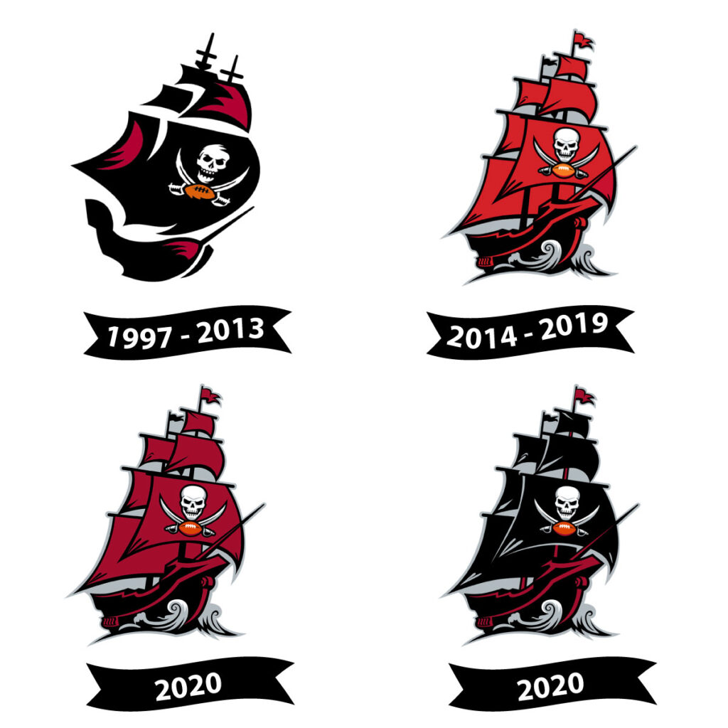
1997 – 2013: Pirate Ship Emblem
In 1997, alongside a major rebranding effort, the Buccaneers introduced an alternate logo featuring a stylized pirate ship. This design showcased a black ship with burgundy accents, prominently displaying the team’s primary flag logo—a red flag with a white skull and crossed swords—on its largest sail. This emblem symbolized the team’s aggressive and adventurous spirit.
2014 – 2019: Updated Pirate Ship Design
In 2014, the Buccaneers modernized their alternate logo to align with updates to their primary branding. The revised pirate ship featured enhanced details and a more vibrant color scheme, with the flag’s red hue intensified. The skull and crossed swords were also refined to present a more menacing appearance, reinforcing the team’s formidable image.
2020 – Present: Refined Pirate Ship Emblem
In 2020, the Buccaneers returned to a design reminiscent of the 1997–2013 era but with contemporary refinements. The pirate ship logo was updated with subtle adjustments, including a darker shade of red for the flag and a more streamlined overall appearance. These changes aimed to honor the team’s heritage while presenting a modernized visual identity.

