Atlanta Falcons
The Atlanta Falcons’ last significant logo redesign occurred in 2003. This redesign introduced a new logo and uniform design for the team.
Description of the Atlanta Falcons Logo
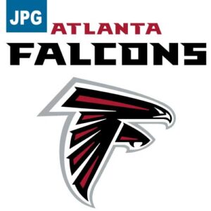
The Atlanta Falcons logo, representing the NFL team, features a stylized falcon in profile facing to the right, with its wings and tail extended downward, forming a silhouette that resembles the letter “F.” The predominant colors are black, red, and white. The falcon’s body is black, with red accents on the wings and tail, outlined in white to highlight the design elements.
The design conveys a sense of speed, power, and aggression—qualities associated with the falcon as an agile and powerful predator. The combination of bold colors and angular lines enhances the image of dynamism and determination, reflecting the competitive spirit and energy of the team on the field.
Description of the “ATL” Lettering
The “ATL” lettering associated with the Atlanta Falcons is designed in a bold and modern style, featuring straight and angular lines that evoke a sense of strength and movement. The letters are typically stylized in a block format with sharp edges, reflecting the team’s visual identity and its connection to the city of Atlanta.
The typography conveys a solid and impactful aesthetic, highlighted by the use of strong colors such as black and red, which are characteristic of the team. This design choice reinforces the team’s athletic nature and determination while maintaining a contemporary and aggressive look, aligned with the image of the team and the NFL’s identity.
The “ATL” is used as a complement to the falcon logo, emphasizing the team’s origin and local representation, symbolizing pride and loyalty to the city of Atlanta.
Showing all 9 results

