The Dallas Cowboys’ iconic logo is one of the most recognizable symbols in sports. Its simple yet powerful design—a lone blue star—carries deep meanings and a rich history. From its creation to the significance behind the star and its colors, the logo represents the team’s identity, its connection to Texas, and its enduring legacy in the NFL.
Who Created the Dallas Cowboys Logo?
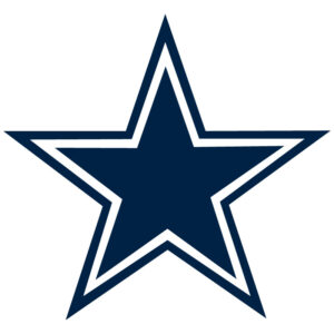
The Dallas Cowboys’ logo, the famous blue lone star, was created in 1960 when the team was founded and joined the NFL. The star symbolizes the state of Texas, known as the “Lone Star State.”

While the exact individual responsible for the design isn’t widely documented, it was developed as part of the team’s initial identity under the leadership of its founders, including businessman Clint Murchison Jr., and the first general manager, Tex Schramm.

Tex Schramm played a pivotal role in shaping the visual identity of the Cowboys, including the logo and uniforms. The logo has undergone only minor adjustments, such as the addition of a blue outline in 1964, making it one of the NFL’s most iconic and enduring emblems.
2002 Redesign: The Dallas Cowboys Logo That Endures Today
The Dallas Cowboys logo was redesigned in 2002, featuring a darker navy blue shade with white and navy blue outlines. This minimalist design, centered around the iconic star, has remained in use to this day, symbolizing the team’s tradition and identity.
What Does the Dallas Cowboys Star Represent?
The star of the Dallas Cowboys holds significant symbolic meaning:
• A Tribute to Texas – “The Lone Star State”
The star represents Texas, nicknamed the “Lone Star State,” symbolizing independence, pride, and freedom. This connection ties the team to the state’s history and culture.
• Unity and Pride
For the Cowboys, the star embodies unity, excellence, and pride, not just as a football team but also as a symbol of Texas heritage and values.
• Tradition and Success
Over time, the star has become synonymous with the Cowboys’ legacy as one of the NFL’s most successful and celebrated franchises. It stands as a beacon of hope for fans and an emblem of greatness for the organization.
What Do the Colors of the Dallas Cowboys Logo Mean?
The colors of the Dallas Cowboys logo—blue, white, and silver—carry specific meanings that reflect the team’s values and identity:
• Blue: Represents trust, loyalty, and determination, reflecting the commitment of the team and its fans.
• White: Signifies purity, simplicity, and unity, highlighting teamwork.
• Silver: Symbolizes elegance and sophistication, aligning with the Cowboys’ premier franchise status.
File Formats for the Logo
• JPG: Best for photos or digital use where small file size is required. Not ideal for transparent backgrounds.
• PNG: Perfect for web graphics requiring transparent backgrounds.
• SVG: Preferred for scalable vector graphics on digital platforms, ensuring high quality on any screen size.
• EPS: Commonly used in professional printing and graphic design due to its compatibility with design software.
• DXF: Used in CAD and manufacturing applications, such as engraving or embroidery of the logo.
Does the Dallas Cowboys Logo Font Evoke Old Western Films?
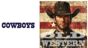
Yes, it’s likely that the font style used in the Dallas Cowboys’ logo and materials was chosen to evoke the aesthetic of old Western films. This reflects the team’s connection to the culture and history of Texas, which is deeply tied to the imagery of the Old West.
Reasons Supporting This Intention:
1. Connection to Texas and the Old West:
Texas, home of the Dallas Cowboys, is often associated with the culture of the Old West, including cowboys, rodeos, and a rustic aesthetic. The typography helps emphasize this cultural connection, giving the team an authentic Texan identity.
2. The Aesthetic of Western Films in the 1960s:
When the team was founded in 1960, Western films and TV shows were at their peak in popularity in the United States. This likely influenced the decision to adopt a typeface reminiscent of that era, aligning with the “cowboy” theme.
3. The Team Name, “Cowboys”:
The very name “Dallas Cowboys” invokes imagery of cowboys and the Old West. A font inspired by that style reinforces the thematic and visual consistency of the team’s brand.
The Font Characteristics
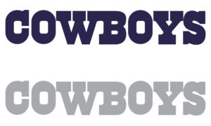
The typeface used in the Dallas Cowboys logo features bold, spaced-out letters that resemble the typography seen in Old West posters. While modernized over time, it retains elements of this rustic, Western-inspired design.
Although no official statement confirms that this was the intention, the alignment between the font choice, the team name, and Texas culture strongly suggests that this connection was deliberate.
By adhering to these guidelines, the Dallas Cowboys ensure their logo maintains its integrity and iconic look across all platforms and mediums.

